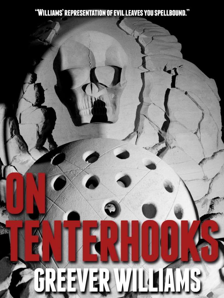
Here’s the artwork I’ve been kicking around for the cover art for my first novel, ON TENTERHOOKS. I would really appreciate your honest feedback as this is my first time desigining a cover and I need all the help I can get! You can click on the cover below for a bigger version.


Awesome. I like the black and grey. Just a thought. Would your name Greever Williams look better in a colour. It seems to get lost with all the white.
Should the review comment take centre stage rather than the title. Perhaps you could swap them. or even better put the review comment on the back. It seems a bit grandiose to proclaim on the front cover.
these are just my thoughts. I love the artwork . well done
Thanks for the feedback Hettie! Yes, I am a little worried about the name being washed out too. I was hoping to stick with just shades of grey and the red, but that might not work in this situation. I’ll definitely give some thought to the review comment as well. I want to brag a little bit, simply to get people to pick it up and turn it over. But I don’t want it to look like I’ve got a king-sized ego either. Things that make you go hmmmmmm…
Thank you very much for stopping by with some excellent suggestions!
Hi there
Cover looks good. I would like to give you a little advice on your web cite. The colors are black with gray letter. If any of your readers are Color blind they might have a hard time reading your words. Just letting you a heads up. Looking forward to your next cover.